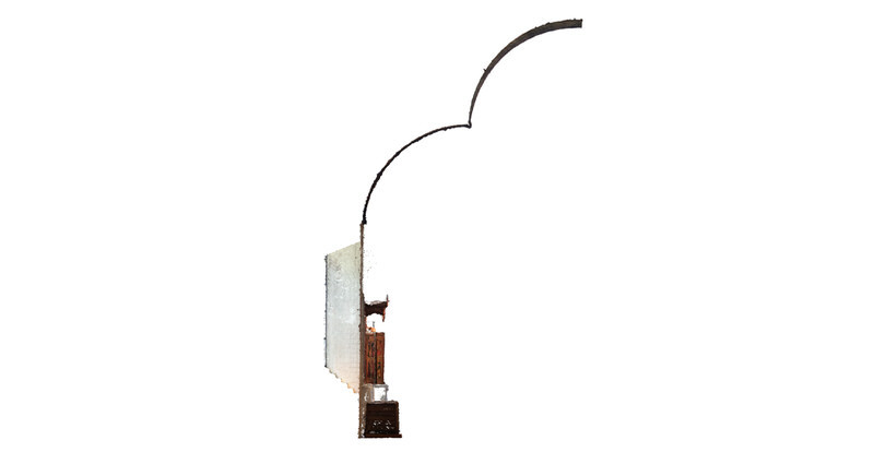
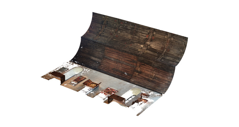
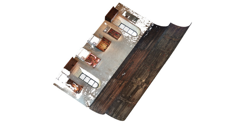
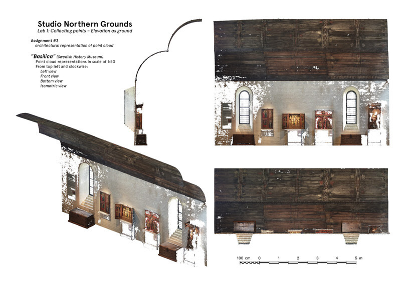
This post covers the process for the first lab of Studio Northern Grounds (HT20).
For a goal-oriented overview, images corresponding with the specific assignments are listed first. After this introductory overview, the process is presented chronologically.
If you want to jump straight to the process, click one of the following links:
Process entry, 11th of September 2020
Process entry, 13th of September 2020
Process entry, 14th of September 2020
Process entry, 16th of September 2020
Process entry, 20th of September 2020
Assignments
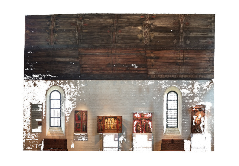
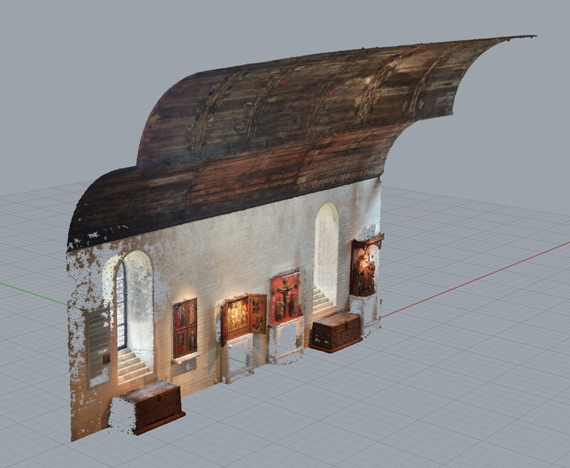
1. 3d scan an interior elevation with intriguing qualities, and create a point cloud of it.
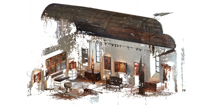
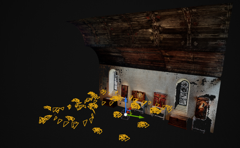
2. Make a diagram showing the camera positions.
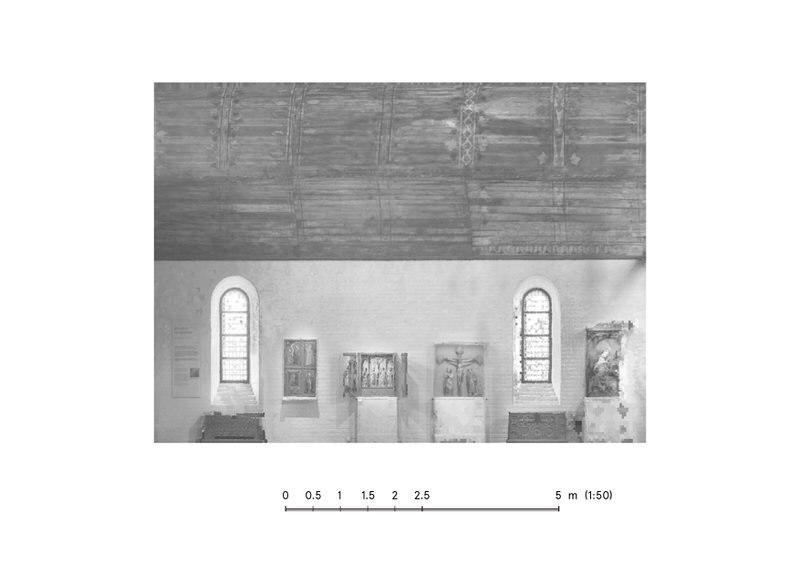
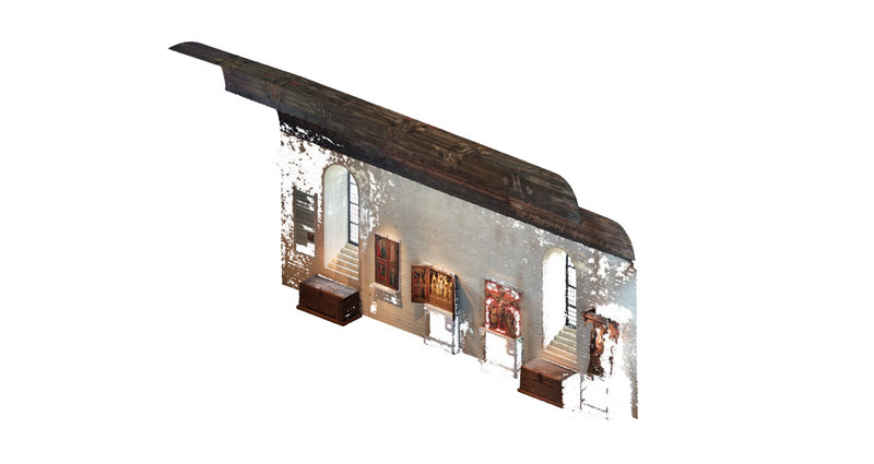
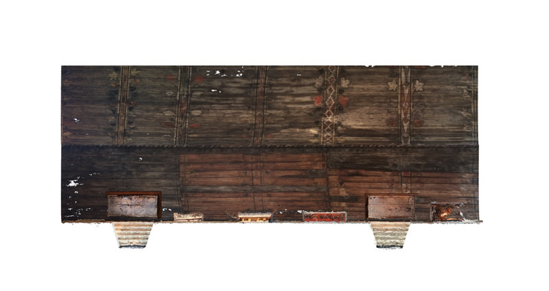
3. Make an architectural representation of the point cloud.
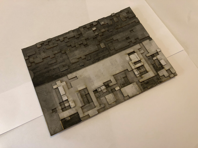
4. With the elevation flipped 90 degrees – rendering it as ground – translate your drawing into a physical model.
Photographer: Mr Bullitt (CC BY-SA 3.0)
With fascination for the Viking Era (last autumn/winter Sofia illustrated a children's immram setting out in Ripa, Denmark, in 860s AD), we aimed to photograph Ulrik Samuelson's painted interior in the entrance to the Golden Room at the Museum of History. At arrival, we realised our vision about 3D-scanning Museum Interiors weren't as straightforward as we'd hoped – all artifacts are generally dimly (poorly) lit so as to conserve their quality through the test of time as long as possible.
Let down by the poor lighting of the Maritime Museum, we decided to skip Ulrik Samuelson's Viking murals, and try with another approach this time around – searching the rest of the Museum for a better lit interior – with no already-made-up ideas and expectations this time around.
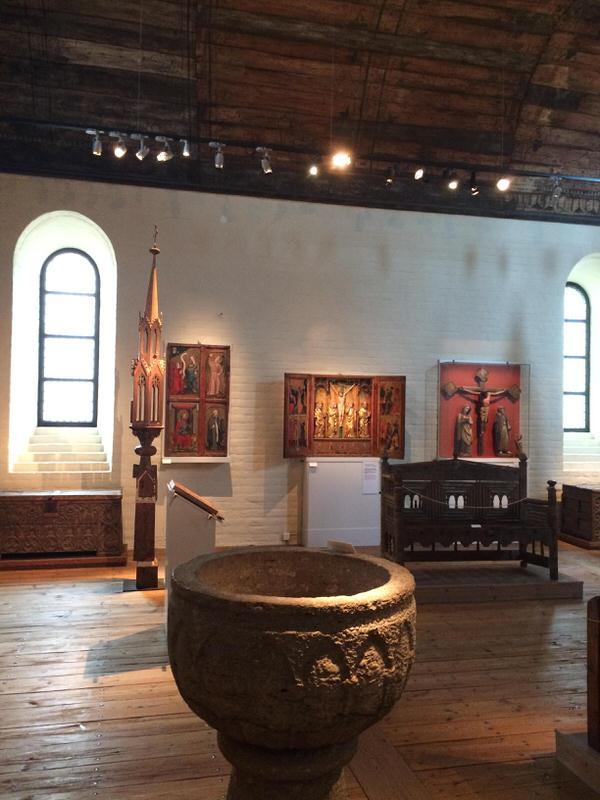
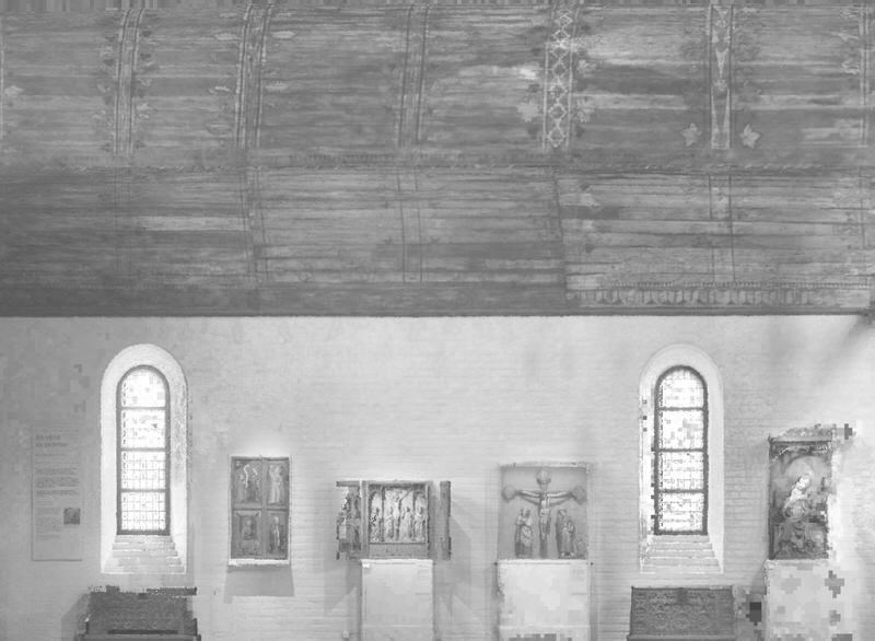
Luckily for us, the "basilica" in the upper story made the perfect interior to capture. It has several interesting architectural qualities. Firstly, with it's gorgeous vaulted wooden roof, the room has a sensation of elaborate depth, and secondly, thanks to its many-folded brick window openings – lots of pure day light beamed through the metal cased window panes.
This time around, due to the camera's viewfinder yet again showing signs of the environment nevertheless being too dark to be faithfully captured by it, we cast aside our rigid workflow and decided to capture the scene with an eight years old mobile phone instead (iPhone 5). This due to our good intentions but preliminary sub-par results at the Maritime Museum – and guess what – we succeeded bouts better with our previous workflow cast aside!
The mobile phone camera has auto-exposure, so it is not as faithfully capturing the environment as a camera with manual settings would. E.g. the pictures taken of the roof are a lot lighter than it truly was, since the auto-exposure compensates for the darkness, but the overall outcome was so much better (and even great), that we hope to use this much simpler technique, when the conditions so allows, in the scope of many projects in the future.
Back home, and we turn on Hyper (the computer Alexander built for gaming purposes six years ago, then having no clue it would be used for architecture), and start Agisoft Metashape. Chronologically, we start feeding photographs from the Maritime Museum first, testing different settings through all the dialogue boxes, which we had ro refamiliarize us with, and when we were happy with the results, we continued with the photos from the Basilica. 298 photos were aligned out of 333, and the dense point cloud ended up with 41 million points.
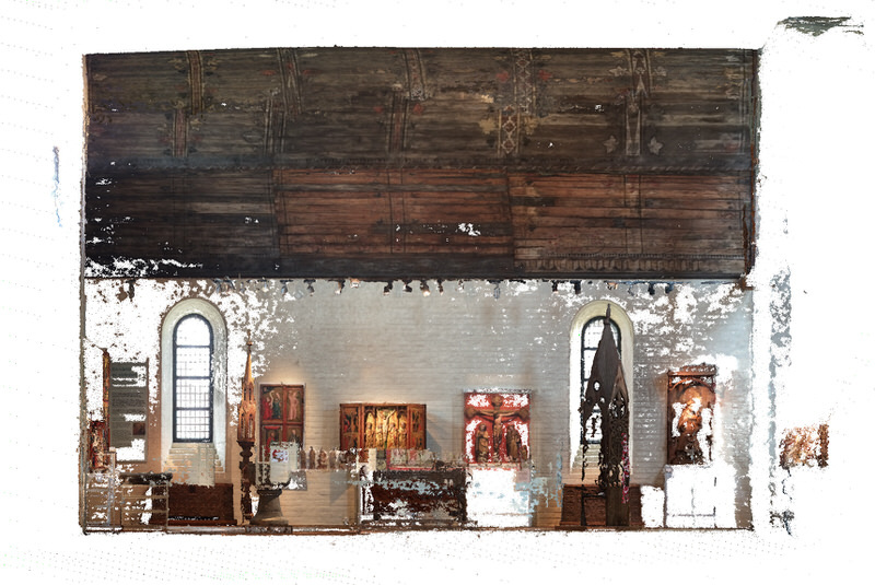
Even though many beautiful artifacts were captured, at least some parts of them, as well as a sense of the whole 3-dimensional experience of the basilica replica, we chose to crop out everything not aligned towards the symmetrical wall, in belief that a cleaner segment would make a more fitting outcome for the last segment of this four-step task.
...that's it for the first part. Looking forward to see what we can do with this beautiful interior facade.
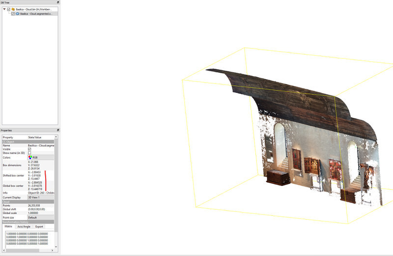
Taking note of the shifted origin point value in CloudCompare, we exported the cropped point cloud as a .las file, for import in Unreal Engine.
Having recreated the camera location and rotation data from Metashape to Rhino/Grasshopper as per this tutorial, we thought long on how to be able to recreate them once again in Unreal Engine. We had an animation in mind, and for performance reasons hierarchically instanced static meshes would be used, so we had two reasons to delve deep into how to recreate the location and rotation from Metashape to Unreal Engine (via Grasshopper).
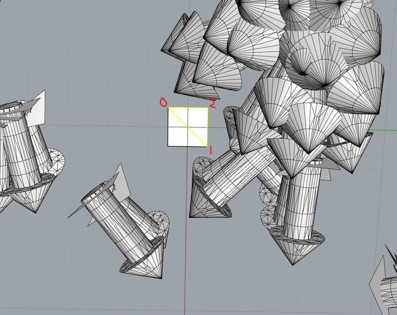
After briefly experimenting with squares, we settled on triangles – the simplest mesh geometry there is. We determined the vertex indices of the original mesh triangle, and ran it through the definition of said tutorial. Then we exported all the triangles as an .fbx file.
With all the 298 triangles imported in Unreal Engine, as well as the point cloud with correctly shifted origin point, the quest for the extraction of accurate rotational values began.
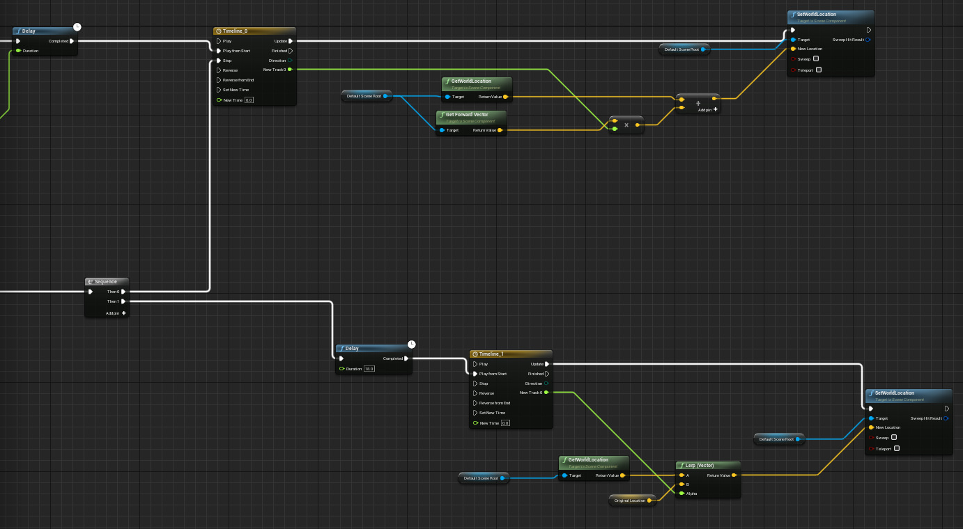
In one sentence, the first blueprint (visual scripting language, based in C++) collects the midpoints between all three vertices and assigns the hypotenuse midpoint as origin point, and the two other midpoints as upwards and rightwards vector, respectively, while calculating the cross product of any two coplanar edges to find the perpendicular normal direction.
The whole blueprint is available via this link.
While the first blueprint handled the extraction of all correct location and rotation data, the second one handles the animation in itself. Firstly, it assigns an individual delay to all bubble meshes, so as to make the animation progress sequentially along the Y axis.
Thanks to the extraction of rotational values in the first blueprint, the animation in itself is really simple: move all individual bubble meshes in their assigned normal direction, and if they collide with the point cloud, halt their motion and then force them to return to their original location.
The whole blueprint is available via this link.
Here is the resulting animation. Due to the new experimental Thin Translucency Shader model not being accurately captured (in its overpowered, brightly lit form or otherwise) by a cinematic camera, it is simply screen-captured video from in-editor.
Back in CloudCompare, we exported images of the cropped point cloud to represent the pointcloud as an architectural notation. Here is an isometric view of the point cloud.
This is the point cloud viewed from below...
...and this is from the left-side view.
This is the elevation point cloud flipped on its back. As of now, we are trying to interpret it as ground, so as to render it into an interesting model for the final assignment.
Another view of the flipped point cloud, evoking further associations.
A collection of architectural representations, produced before the focus of only elevation had been internalised.
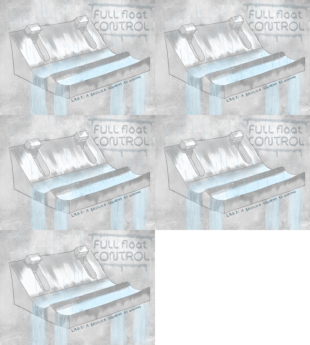
Keeping on flipping, we overdid the rotation so as to make not the vertical wall horizontal, but the arching part of the interior. Thus we associated the new orientation of the basilica wall to the flood control infrastructure of the Los Angeles River, and interpreted in concept art the flipped elevation as a similar system.
After Monday's tutorial with our tutors, our interpretation of the task took another turn, and we shifted focus to finding an interesting way of representing a quality found in the point cloud, rather than translating the rendered point cloud into a traditional line drawing. Thinking of the point as physical being, mathematically consisting of XYZ values in the cartesian world space, we realized that there are also RGB values determining its colour values, allowing for an interpretation for the eye, and an interesting aspect to investigate further in representation:
What happens when the RGB values of the point cloud are turned into a height map (a greyscale intensity texture; calculated as the average of the RBG values for each specific pixel) and replaces the data originally captured for the points' Y values (Z when flipped)?
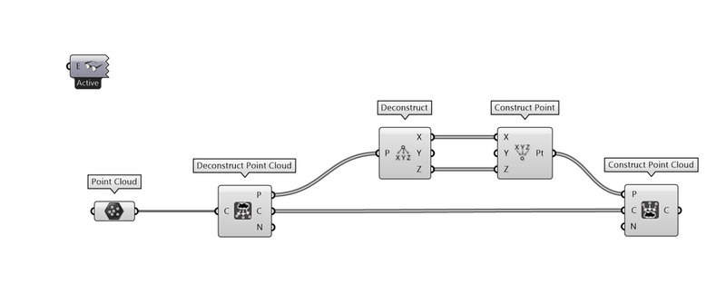
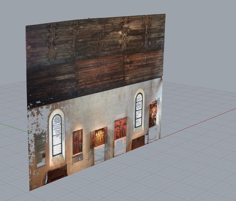
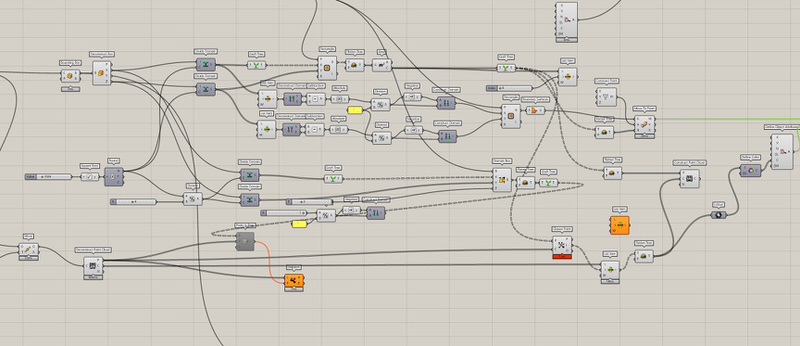
With a simple Grasshopper definition, we replace all Y values for each point with 0... You can find a tutorial for how we did this here.
Here all points are assigned a value of 0 for the Y axis, so as to correctly run the Grasshopper definition Alexander programmed for this purpose, filling the RGB data gaps missing in the dense point cloud.
With Alexander almost losing his head in the branches of this node tree, and after much trial and error, it simply does this: create a rectangular grid projected on the flat point cloud, take the colour value of the closest point for each grid cell, and assign the colour to the surface of the grid cell. Thus the "pixel grid" fills in areas where the space between points are so large that they are interpreted as holes.
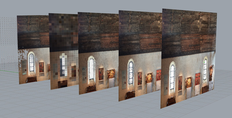
From left to right: the original (decimated) point cloud of 410K points, a pixel grid with 1024 cells, a pixel grid with 11904 cells, a pixel grid with 35964 cells, and a pixel grid with 47872 cells.
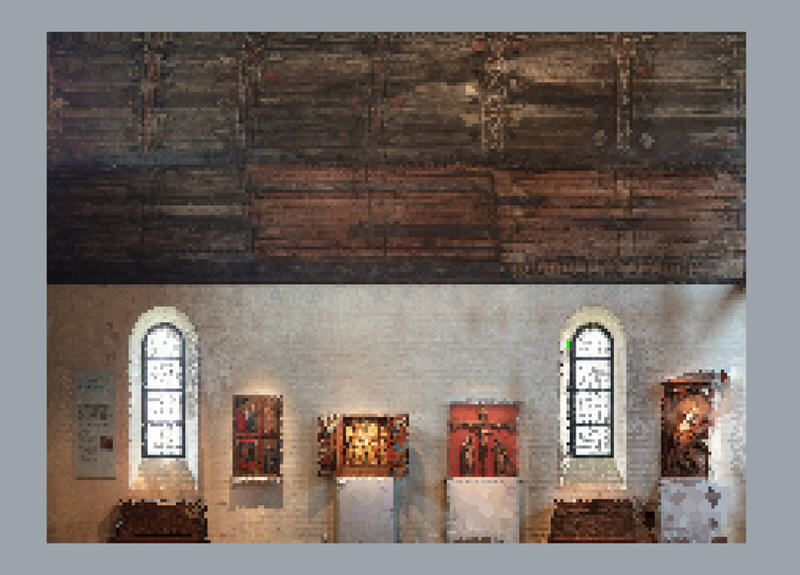
With five different results to choose from, we picked the original decimated point cloud, reflecting the highest perceivable resolution of the basilica segment, to blend together with the 35964 pixel grid cell behind (we realized that a higher number pixel grid cells did not produce a more naturalistic look), into one raster image.
Only the 410K point cloud.
The "closest-point pixel value" cell grid with 35964 cells.
The point cloud merged with the pixel cell grid. This retains the resolution of the point cloud where data was acquired, and where no points were captured, the RGB value of the closest point for each grid cell fills the void.
The green points were actually there from the beginning – we do not know why they appeared, since they are not there in the source images but are visible in the original dense point cloud.
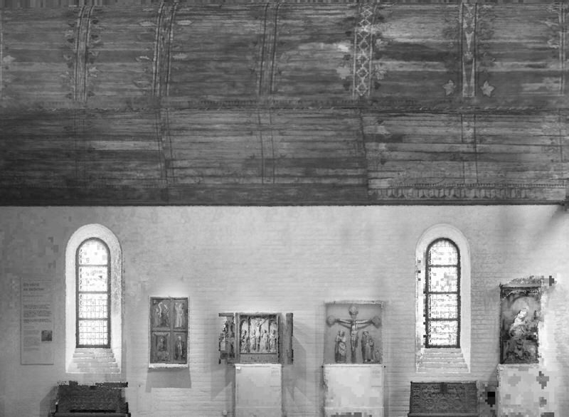
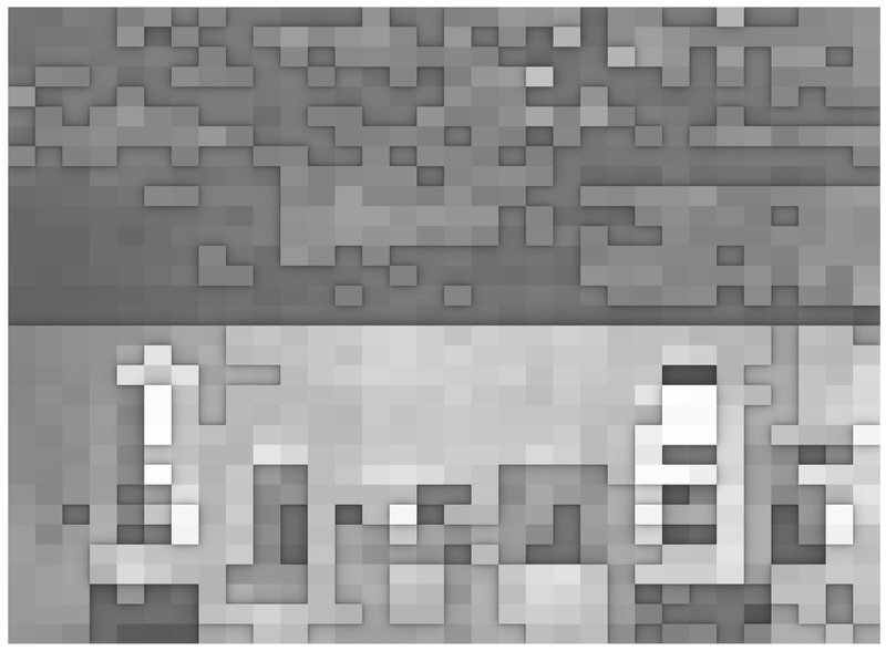
With all RGB values converted to greyscale, and in perceptual colour space (gamma=2.2).
Here the values are shown in linear colour space (gamma=1.0), so that the values are correctly mapped and ready to be interpreted as a heightfield map.
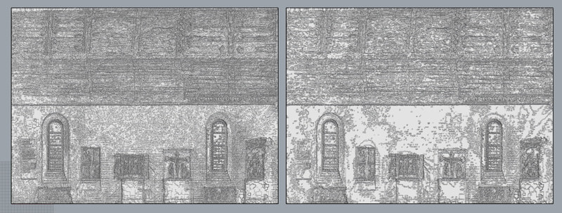
Here the difference between reading the heightfield bitmap as perceptual (left) or linear (right) gamma is shown. While the perceptual gamma heightfield has more contrast, the linear gamma heightfield would be more correct (if the source values would actually be valid heightfield data – now the source values are the desaturated texture values, so there is really nothing wrong with going forward with the one or the other). We picked the linear gamma heightfield.
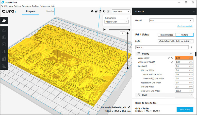
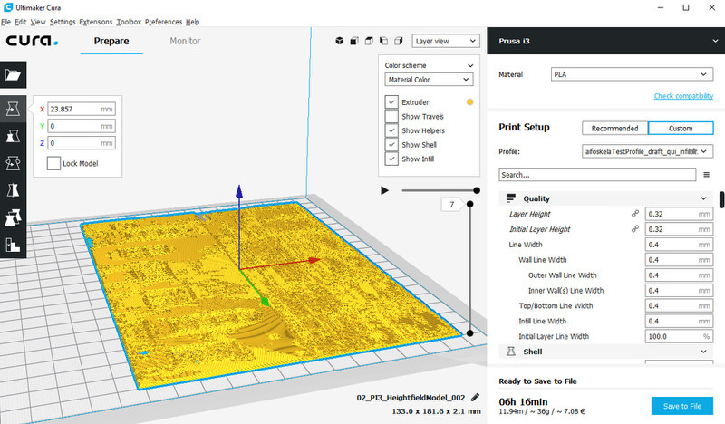
Initially, we wanted to recreate the height data with a greater range between the lowest point and the highest point, but our 3D printer could not handle the layer thickness required to produce such a job in a reasonable time.
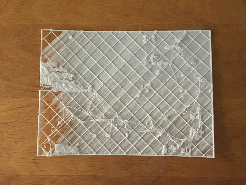
As evident of our first try, the layer thickness was too large, and we had to reconsider.
Instead of surveying the 3D printer for almost 2 days straight, we chose to reduce the Z height of the physical model. This reduced the job time to reasonable levels, but also reduced the dramatic effect of the difference in maximum and minimum height. We think that the texture of the different RGB levels still will show, at the very least at a tactile level.
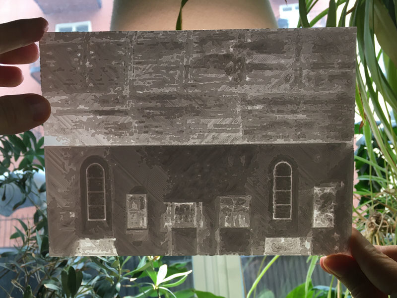
The 3D-printed model finished after approximately six hours.
The thin 3D-printed model photographed towards a strongly lit backlight in our window sill conservatory.
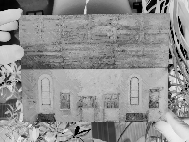
Here we have desaturated the same photograph as above to greyscale and inverted the values. This way the model looks very much the same as the 2D greyscale drawing produced from the RGB values extracted from the decimated point cloud.
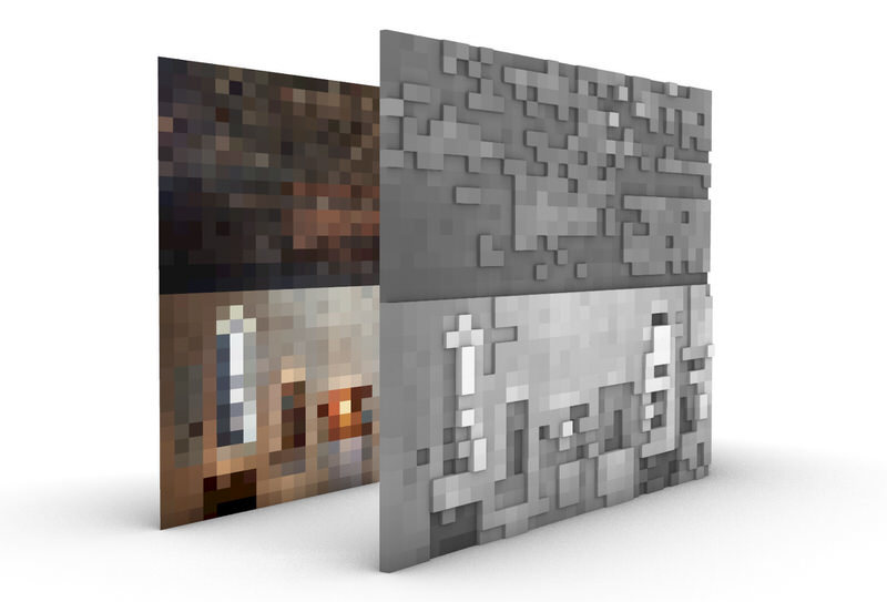
Starting off with the 1024 pixel grid cell image, we added its RGB values (0-255) and divided them into normalized greyscale values (0-1). After this, we multiplied by five so to match up with five sheets of cardboard for the model we were to build, then rounded the greyscale value of each cell to the closest integer in a range between 0-5 to get average height data, and lastly extruded the 1024 cells in millimeters according to their corresponding integer.
This is the Grasshopper definition Alexander made for the 3D model portraited above.
Here is the height data information of the layer structure (with a greyscale range from 0-5 mm) we used to create our physical model in the laser cutter.
To retain the texture from the 3D printed model we created earlier, we simply multiplied the negative of the photograph we took of it earlier with the greyscale heightfield image, and printed it out in monochrome greyscale. The laser cutters ran over both the cardboard and the printed sheets taped together at the same time, allowing us to simply glue the five layers together as a finishing touch.
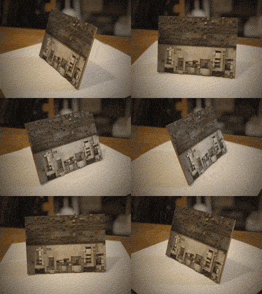
Here is the final physical model, flipped so as to consider it as ground.
If you would like to return to the overview of our Studio Northern Grounds posts, please click here.
